Tanzhaus Luzern is Central Switzerland’s largest dance school. Its rebrand had two goals: to create a visual identity as open, contemporary, and full of energy as the school itself, and to make its website clearer and easier to use. The result is a cohesive and flexible brand that extends across web, social media, and print – and can be confidently maintained by the Tanzhaus team in two languages.
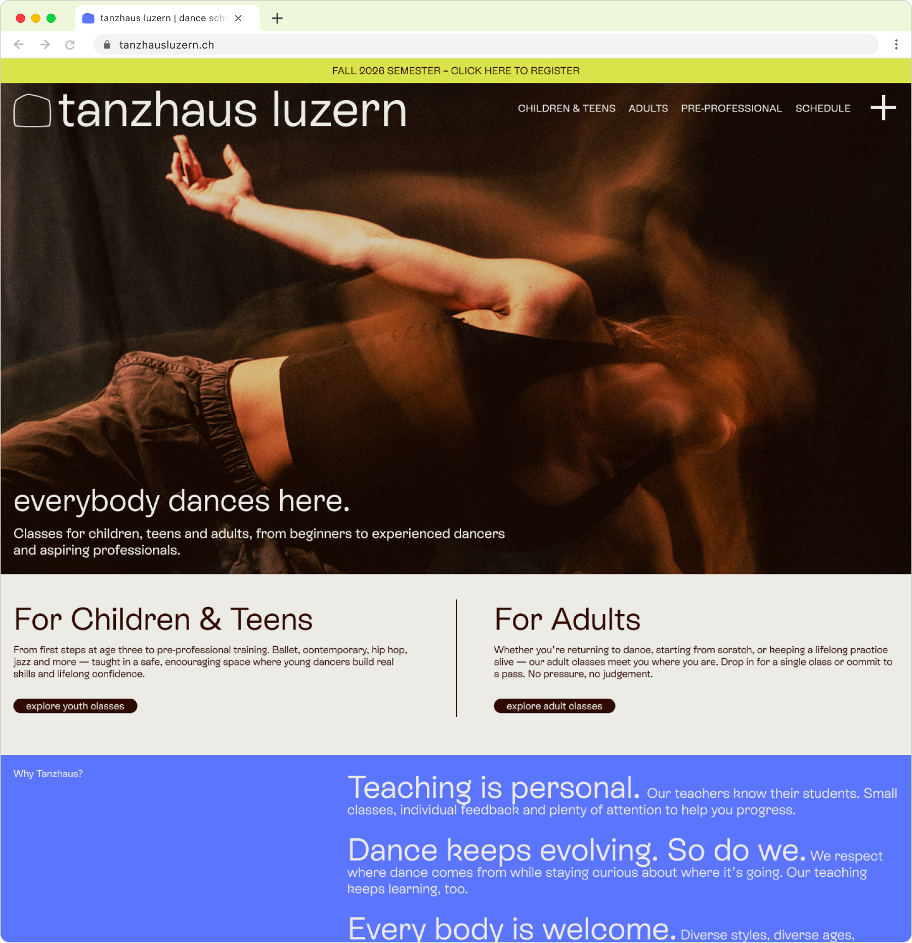
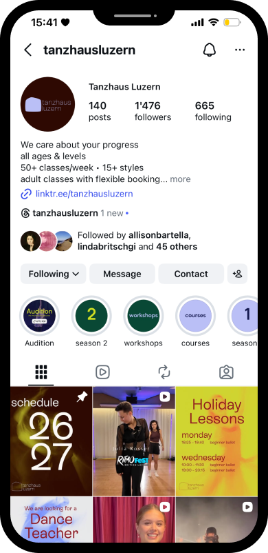
Studio Miro created the logo, icon set, and animations and established how the brand carries over to social media. Each dance style offered by the school has its own icon, allowing the system to extend naturally across both digital and printed materials.
Together, we developed the typography, color palette, and broader visual language resulting in a flexible system of colors, icons, and imagery that the Tanzhaus team can easily combine and update themselves.
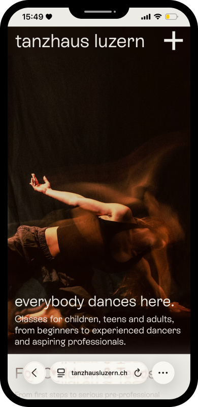
Photography became a defining part of the new identity. Working with owner Olivia, I developed an art direction that expresses the school’s welcoming and supportive approach to dance – a deliberate contrast to the strict traditions often associated with ballet. Dennis Wittmann captured this beautifully, translating movement, confidence, and emotion into still images.
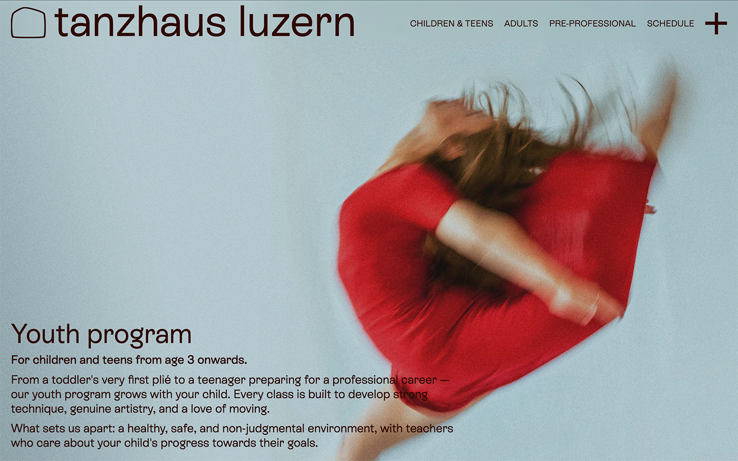
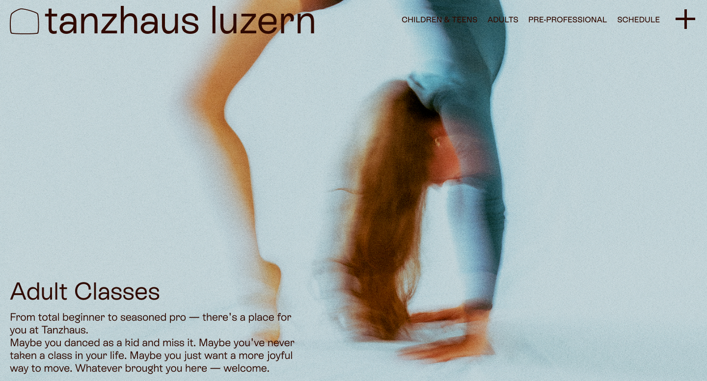
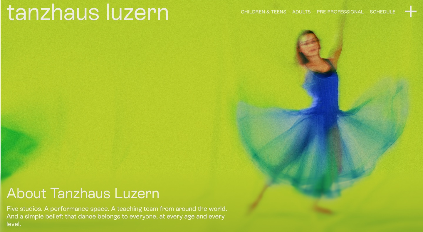


Building on the new identity, I designed and developed a website centered on clarity. The homepage establishes clear user journeys from the outset, helping families and adult dancers quickly find the classes and information relevant to them. Clear calls to action and distinct pathways make it easier for each audience to understand the offer and know what to do next.
To keep the experience light and spacious, the header becomes more compact as the visitor scrolls. Its colors adapt automatically to each section’s background, maintaining contrast and legibility while allowing the photography and content to take center stage. The editable, bilingual setup also gives the Tanzhaus team control over the site’s day-to-day content.

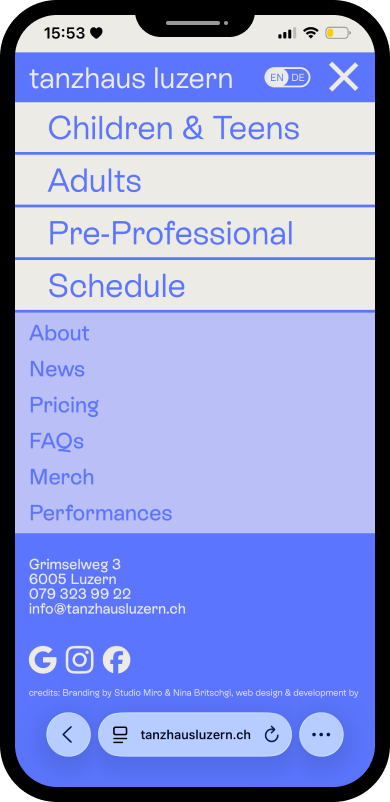
Over time, the old website had accumulated numerous pages, making key information harder to find. For the relaunch, I created a clearer hierarchy: essential pages remain visible in the header, while a full-screen menu – opened via the large plus button – organizes secondary content such as pricing, news, and FAQs alongside utility and legal pages. Contact details, social links, the school’s WhatsApp group, and the German–English language switch are also gathered in one easy-to-navigate space.
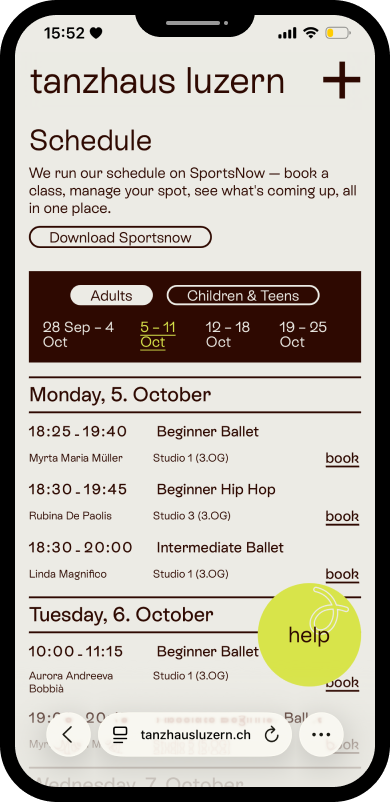
The custom, mobile-friendly schedule draws its information directly from SportsNow, the system Tanzhaus has already used for several years. Nothing changes in the team’s existing workflow; the same class data is simply presented on the website in a way that makes more sense to students and families.
Visitors can switch between adult and youth programs, browse upcoming weeks, and quickly compare times, teachers, locations, age groups, availability, and cancellations. Adults can book classes directly, while families are guided toward the appropriate trial or registration form.
Studio Miro created the logo, squiggle icon set, and established how the brand carries over to social media.
Photography by Dennis Wittmann, Olivia Lecomte, Ye Lun Qi
Copywriting in collaboration with Olivia Lecomte
